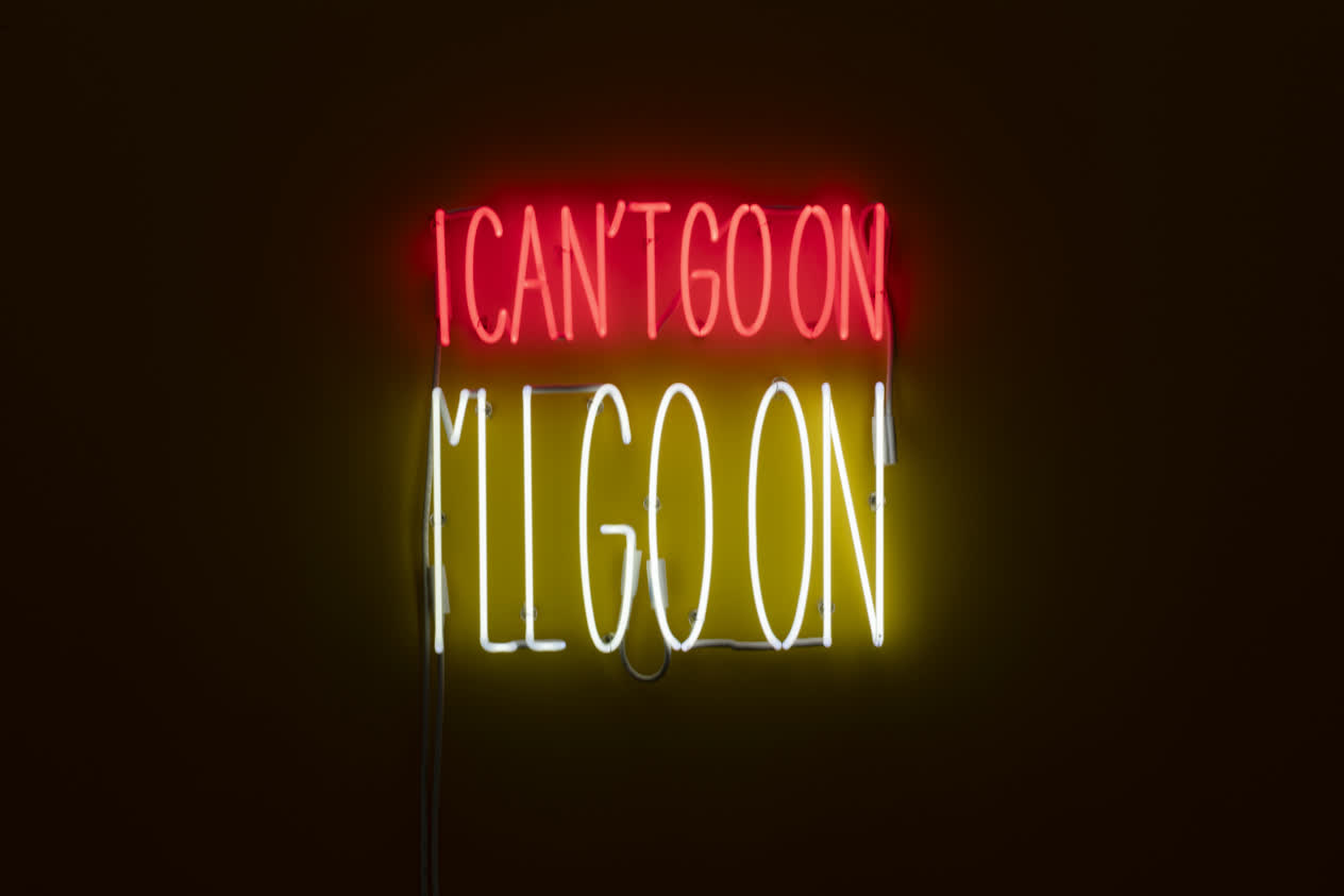
John Giorno Poem Prints 1991
Since the 1960s, John Giorno embodied efforts to instill contemporary poetry with the conceptual underpinnings of recent art. His production encompasses radical experiments with poetic appropriation, including poems made up of texts drawn entirely from newspapers and other forms of mass-produced print media. His work is also closely associated with performance poetry, in the form of Happenings, film and audio recordings, and various unconventional means of delivery, such as the 1968 Dial-A-Poem project, which allowed participants to hear figures such as Ted Berrigan, John Cage, Allen Ginsberg, Frank O’Hara, and Emmett Williams reciting their work over the telephone. More recently, Giorno had focused on a format he referred to as “poem prints,” in which sharp bursts of language rendered in vigorous typeface are set against fields of bold color. The works convey an almost audible sense of energy and agitation, reflecting the manic tendencies of graphic design for commercial mass media.
Identification
Title
Poem Prints
Production Date
1991
Object Number
2016.302.1-10
Credit Line
Collection Pérez Art Museum Miami, acquired from The Sackner Archive of Concrete and Visual Poetry, with support from the John S. and James L. Knight Foundation
Copyright
© John Giorno
https://www.pamm.org/en/artwork/2016.302.1-10
Copy artwork link
Physical Qualities
Medium
Screenprints
Dimensions
each: 14 3/8 x 14 3/8 inches
Visual Description
“Poem Prints is a collection of nine screen prints on paper by artist John Giorno. Each individual print is square in shape, measuring fourteen by fourteen inches. Each print is bordered by a thin white wooden frame, less than half an inch in thickness. The nine framed prints are arranged in a square grid made up of three rows and three columns when displayed on the gallery wall. The edge of the frames line up perfectly, both vertically and horizontally, with around two inches of space separating them from one another. Taken altogether, the nine prints create a three-and-a-half-foot tall square arrangement of closely clustered and rigidly aligned white framed text-based artworks.
Each of the screen prints is blazoned with varying lines of English-language text rendered in a billboard-like composition. The typeface chosen by the artist features long and extended letterforms that make the phrases and sentences within each of the frames easy to read at a distance.
The text varies in size and placement within each square. Some words are printed large for emphasis, covering over two thirds of the square at times, while some lines of text feature several smaller words that complete a phrase or sentence. The prints also differ when it comes to the colors used in their printing process.
For example, the square at the very center of the composition reads: “Life is a killer.” It has a golden background, with the word “Life” printed in black. This first word dominates the square because of its large size. It extends the entire width of the square and three quarters down the length. The bottom quarter of the square is taken up by “is a killer,” printed in red. When compared to “Life,” These three words, “is a killer” are much smaller in order to fit within the remaining space of the square
The bright rainbow of colors chosen for the lettering and backgrounds, coupled with the declarations of each of the prints, make many of them appear and read like colorful advertisements.
Starting on the top row, in the upper left, the top three prints read:
That gun’s got blood in its hole
Sugar alcohol meat & cigarettes
It’s worse than I thought
The middle row, starting on the left, the middle three prints read:
We gave a party for the gods and the gods all came
Life is a killer
I’m waiting in line with my groceries and I want to get away without incident
The bottommost row, starting on the left, the final three prints read:
Nothing recedes like success
I don’t need it I don’t want it and you cheated me out of it
Put your ear to stone and open your heart to the sky “